
Since forever, to get to your Apple Watch’s Control Center, you would swipe up from the bottom of your watch face or, when inside an app, press and hold the bottom of the screen, then swipe up.
But with watchOS 10+, all that changes, and you can thank Apple’s introduction of Apple Watch widgets for that!
Now, when you swipe up from the bottom of your watch face, you’ll see your list of widgets, not your watch’s control center! So, how do you get to control center? Just push the side button!
Contents
Related reading
- How to access the Apple Watch recent apps dock or close apps in watchOS 10+
- Here are the key features and changes coming to your Apple Watch via the new watchOS 10
- Widgets on Apple Watch, a new road to delight watch owners with watchOS 10
How to open Control Center using watchOS 10
The good news is that accessing Control Center is actually easier than it ever was–all you need to do is press the side button once. 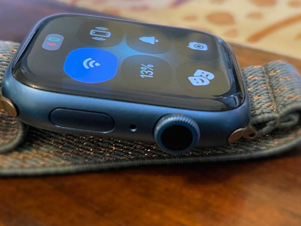
If you updated to watchOS 10 and above, swiping up on your watch face no longer gets you to Control Center–instead, you’ll see your smart stack widgets and list of other widgets. To get to Control Center, you need to press the side button.
- Pressing the side button once takes you to your Control Center. This always works–when you’re on the watch face, inside an app, or reviewing your widgets. Pressing the side button always takes you to Control Center.
- Pressing the side button twice opens your Wallet and Apple Pay (if you set that up.)
Close Control Center by pressing the side button again or pressing the Digital Crown.
Now, if you’re one of the many that pressed the side button to access your favorite or most recently used apps via the Apple Watch Dock, that function has moved to a double-press of the Digital Crown. 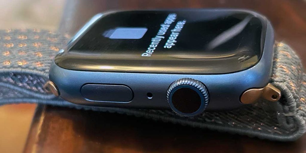
Confused yet? There’s a learning curve
You’re not alone; we were too! It’ll take some time, but within a few hours or days, you’ll get used to the new button functionality in watchOS 10.
These button and user experience updates are just something that we’re all going to have to get used to!
Outside of how you launch Control Center, all the features of control center remain, including doing things like checking your battery and turning on low power mode, using AirPlay, silencing your watch, choosing a Focus and modes like AirPlane or theater, pinging your paired iPhone, using flashlight mode, increasing the text size, turning on water lock, etc.
Final thoughts
What do you think of all these UX updates and changed button functionalities? Are they working for you or against you? Let us know in the comments.


I’ve been an enthusiastic user of an Apple Watch ever since it correctly indicated my atrial fibrillation. However, it also introduced me to how much good design could be put into using such a small object by just using screen swipes and a single button (crown wheel) press. Unforunately, this opinion has changed overnight with OS10.
I have large hands and large fingers. Swiping the screen and pressing the crown wheel to navigate has not been a problem for me. However, my most used screen, the control centre, has lost its swipe function and access has been relegated to the prevously rarely used (for good reason, imho) side button. Because of my large fingers, I have to grip the watch and stab at where the button is in the hope of depressing it. The swipe function now accesses items in a menu that I have no need for.
To make things worse, I have arthritis in my thumbs and pressing the side button is actually mildly painful. More so is the new double tap gesture. Thanks, Apple.
The Control Centre is not the only swipe-accessed function that has gone. There are four screens that could be swiped through to look at my sleep history. I check these every morning but they are now accessed by turning the crown wheel, something I find very difficult. Do this with large fingers and I keep jumping screens. Annoyingly, the swipe function now does nothing at all in these screens, so why lose it?
These aren’t game changers but I am at a loss to know why good design has been turned into poorer design overnight. How mechanics or other people with calloused fingers get on, I can’t imagine.
So yes, I’m not impressed! I have submitted feedback to Apple but what chance does one user out of millions have of making it change its mind? Anyway, thank you for giving me a small platform to let off steam over my first world and largely inconsequential problems. There are worse things to get upset about.
Hi John,
Thank you for such a thoughtful and honest criticism of watchOS10 and its challenges for people with mobility difficulties. Apple does take accessibility seriously, so I hope they follow up on your feedback. It sure seems like Apple did not test watchOS 10’s changes to swipes and button presses on groups similar to you, which is surprising. It’s particularly surprising since one of the big markets of the Apple Watch is for older people and the families of older people to help with monitoring health, falls, medications, and contacting emergency services when needed.
Several of my older family members also struggle with arthritis in their fingers and limited mobility–and they, too, have similar problems pressing the buttons–especially the smaller side button. It is far easier for them to swipe on the screen, then press a button (or buttons.)
I think the more people that add this type of feedback, the more likely Apple listens.
Thank you again for your insights,
Amanda