
One of the reasons I’ve stuck with Fitbit over the years is the simplicity of its app. It’s easy to use and understand for all types of folks, from young to old. And many of my family and friends loved the social aspect of the app, like the leaderboards, badges, and the now-sunsetted groups, adventures, trophies, and challenges feature.
Recently, Google (which acquired Fitbit in late 2019) released a glimpse in its Keyword blog into how they imagine the future Fitbit app–and it’s pretty different from the Fitbit app we’re used to.
Google claims the update brings a simpler design with more content, like on-demand video workouts to follow along, and a push for more Premium membership features.
Unfortunately, that comes at the cost of less community and the social interactions that created a strong Fitbit following over the years.
Contents
Related reading
- How to move your Fitbit account to a Google account
- If you’re tired of Google’s Fitbit changes, these devices are the best alternatives to Fitbit
About the redesigned Fitbit app 
Okay, so what’s really changing?
Although at first glance, it doesn’t seem like a big change, it actually is!
First, you’ll find a simplified app with what Google calls a cleaner interface. Like the current app, you see tabs at the bottom–now limited to three total tabs.
Additionally, things like the charts, graphics, and icons are larger so it’s easier to quickly review your stats. And the color palette also appears more muted, with less colors used.
If you use or used to use Google Fit, some of these design changes will look very familiar.
Dark mode?
For folks that hoped for a dark mode, we don’t see that–sorry!
The three Fitbit tabs
Expected in the Fall of 2023, the updated app features three lower tabs to help you navigate content. These include the Today tab, a new Coach tab, and a new You tab. Gone are the Community, Discover, and Premium tabs.
The Today tab is the most familiar and has been a mainstay of the Fitbit app for years. Although Google made some changes, most of the Today tab remains the same. You still see your metrics at a glance, including things like your steps, active zone minutes, stress, sleep, and more. 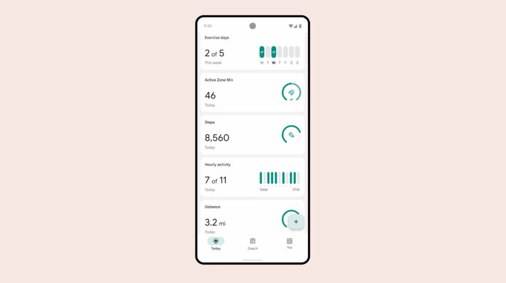
The Coach tab is a combination of the old Discover tab, where you can access mindfulness sessions or play on-demand workouts and follow along, and the old Premium tab, where you get access to advanced health and fitness features available to paid members only.
A neat aspect of the Coach tab is tat you can filter those workouts by how much time you have available to exercise and/or what equipment you have to workout with. 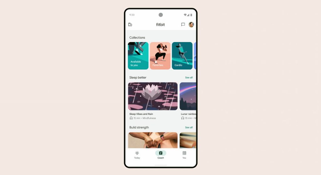
Additionally, when you launch a workout, it automatically showcases it in full-screen landscape (or movie view.) And taking a page from Apple Fitness+, you’ll see your workout stats like heart rate, calories, and active zone minutes on-screen. 
The You tab is where you update things like your personal details, goals, and track you achievements and badges. It’s also where you connect to the Fitbit community and any private groups. 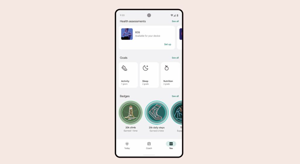
Google is keeping the same names for those familiar Fitbit badges but is redesigning them with a new look (that we’re not fans of–we think it’s pretty ugly.) 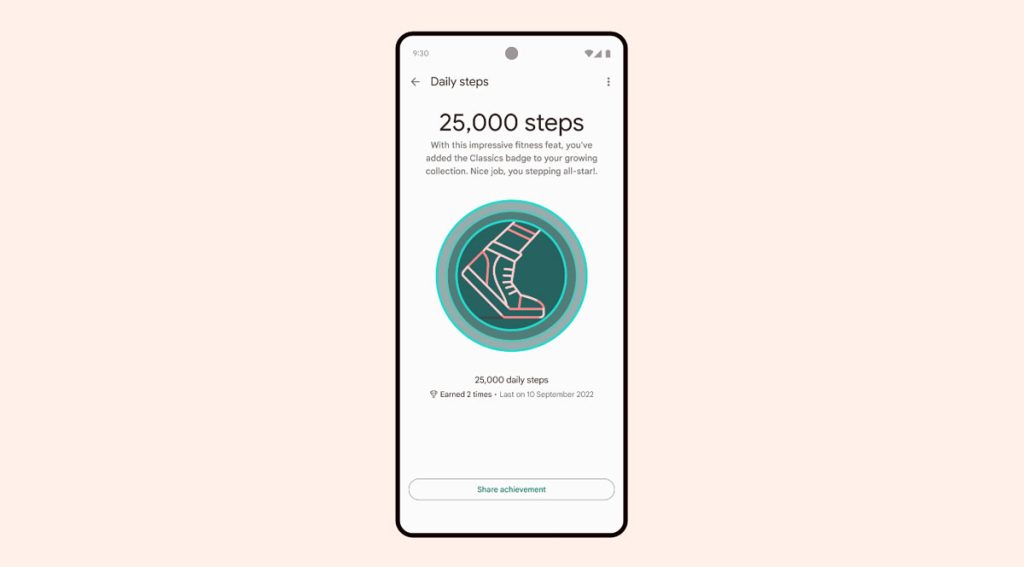
The new Fitbit app–what’s cool and what’s not!
Now, we haven’t gotten our hands on the updated Fitbit app yet (it’s with beta testers), but from the limited information Google provided, what we see is that Google is moving more towards Fitbit competing with Apple’s Fitness/Health apps and Apple’s Fitness+ subscription.
What we think is awesome in this redesigned app is that it now uses the Fitbit’s sensors to track your workout metrics on-screen when you follow one of the app’s guided workouts, including things like calories burned, heart rate, and total workout time. But the cost for this is likely a push to subscribe to Fitbit Premium to access most of those workouts.
What we don’t like is the continued movement away from the Fitbit Community and all the social aspects that made using your Fitbit fun with others! It started with Google removing challenges, public groups, and trophies earlier this year, and this redesign affirms that move away from the social.
You don’t need a Google account to use the redesigned Fitbit app–at least not yet
If you use the Fitbit app regularly, you likely saw a prompt asking you to migrate your Fitbit account to your Google account (or set up a new Google account.) 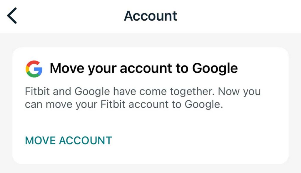
If you’re like me and sticking with a Fitbit account for now, Google says those Fitbit accounts will remain active until at least early 2025. So, for now, you don’t need to update to a Google account to use the new Google redesigned Fitbit app.


I do not like the new app at all!!!!!
I hope they rethink this change. I have been an avid Fitbit user since Jan 2017. I recommend it to all of my friends…BUT, this new app is making me crazy – too large of writing (and I am 70 years old). I like contrasts…the colors are way too muted for me. I must keep scrolling and going to another page to get my info. NOT HAPPY!!!!!!!!!
The updated app is pretty lame